
Client Project

1.0 Title : Predict factors indicating post survey completion for Uprise customers.
Datasets
1. Uprise dataset
2. Intercom dataset (Merged both on email_id)
2.0 Data Import , Cleaning and Exploratory Data Analysis
df_raw=pd.read_csv('./datasets/rawdf.csv')
df_raw.shape
(1176, 230)
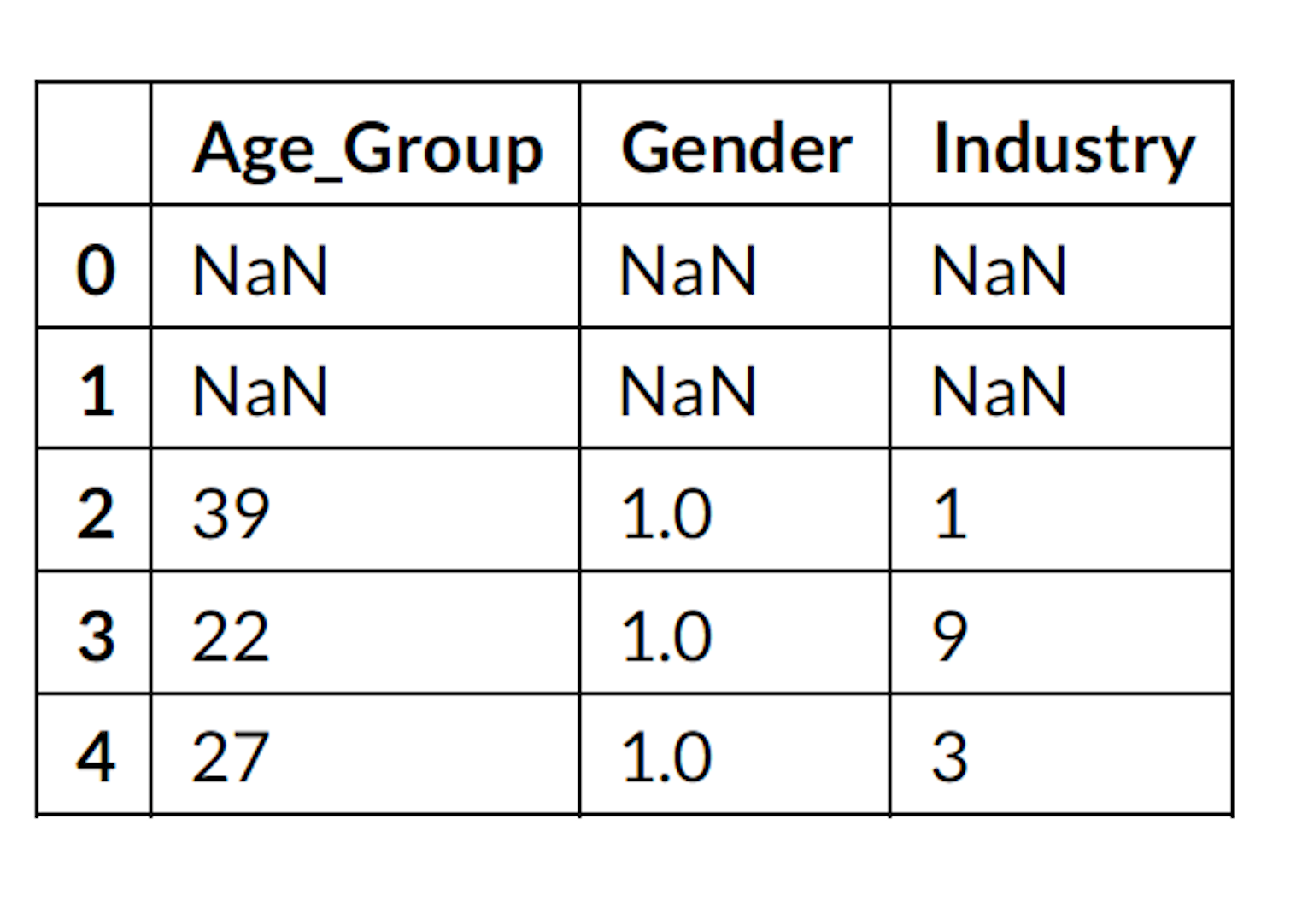
df_raw[['Age_Group','Gender','Industry']].head()
2.1 Data Cleaning, Processing and Feature Engineering:
This was an interactive process.
1. Changed d-types
2. Used Regex to remove unwanted characters
3. Created a Data Dictionary and renamed columns.
4. Removed rows with null values (Business input).
5. Convert all categorical columns to numeric/discrete columns.
6. Removed outliers.
7. Use Tf-IDF to find most common industries and narrow down number of
industries from 1000 categories’ of industries to 14 major ones.
8. Used ‘Pandas Profling’ library to alter the columns with lowest information gain.
9. Convert Target variable ‘post_psycap_total’ from numeric to discrete.
a) Row with numeric value in ‘post_psycap_total’ labelled as 1.a) Row with numeric value in ‘post_psycap_total’ labelled as 1.
b) Row who Null value in ‘post_psycap_total’ labelled as 0.b) Row who Null value in ‘post_psycap_total’ labelled as 0.
df_clean=pd.read_csv('./datasets/cleandf_new.csv')
df_clean.shape
(972, 167)
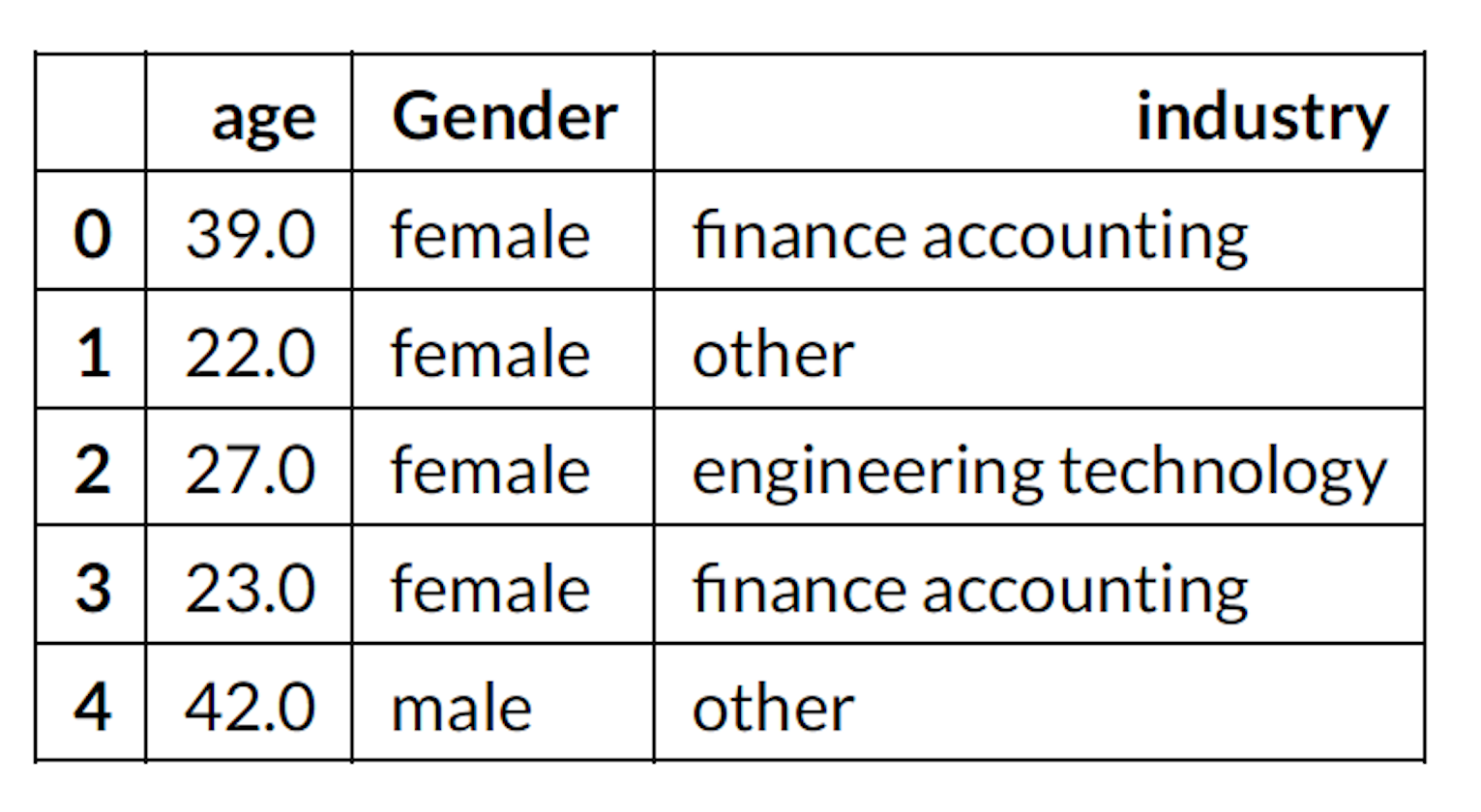
df_clean[['age','Gender','industry']].head()
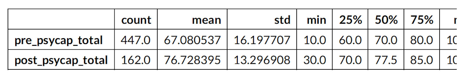
df_clean[['pre_psycap_total','post_psycap_total']].describe().T
2.2 Exploratory Data Analysis
1. Explore the entire data set to find trends.
2. Univariate Analysis
3. Boxplot visualisation.
4. Remove outliers.
5. Histogram visualisation.
6. Interesting insights visualising dates and time.
2.2.1 Univariate Analysis
df_eda=pd.read_csv('./datasets/eda_csv.csv')
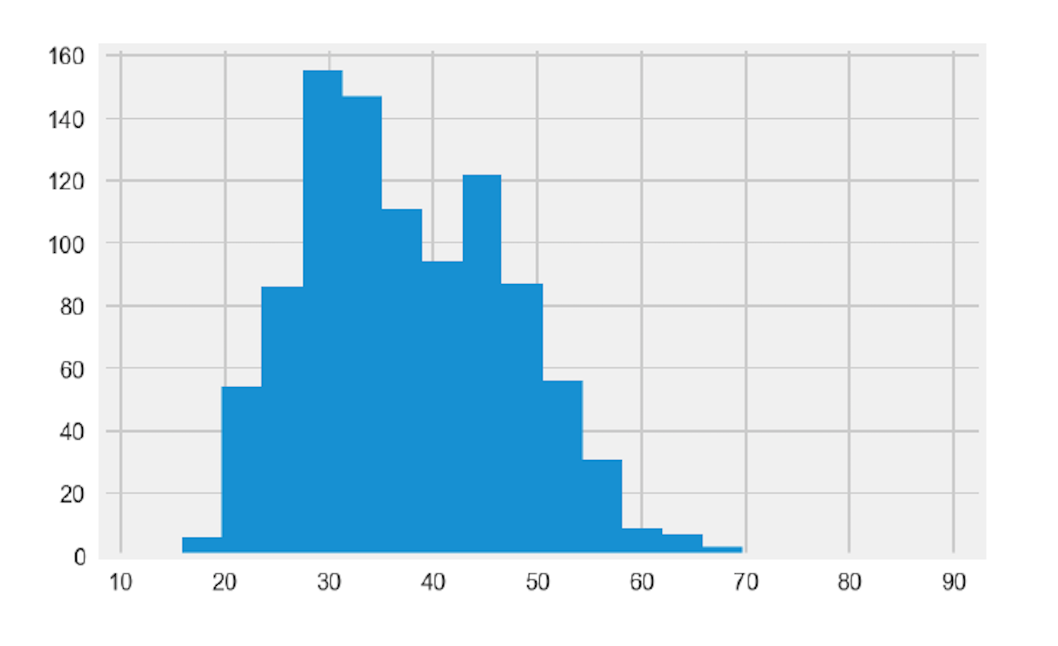
plt.hist(df_eda['age'],label='Age',bins= 20 )
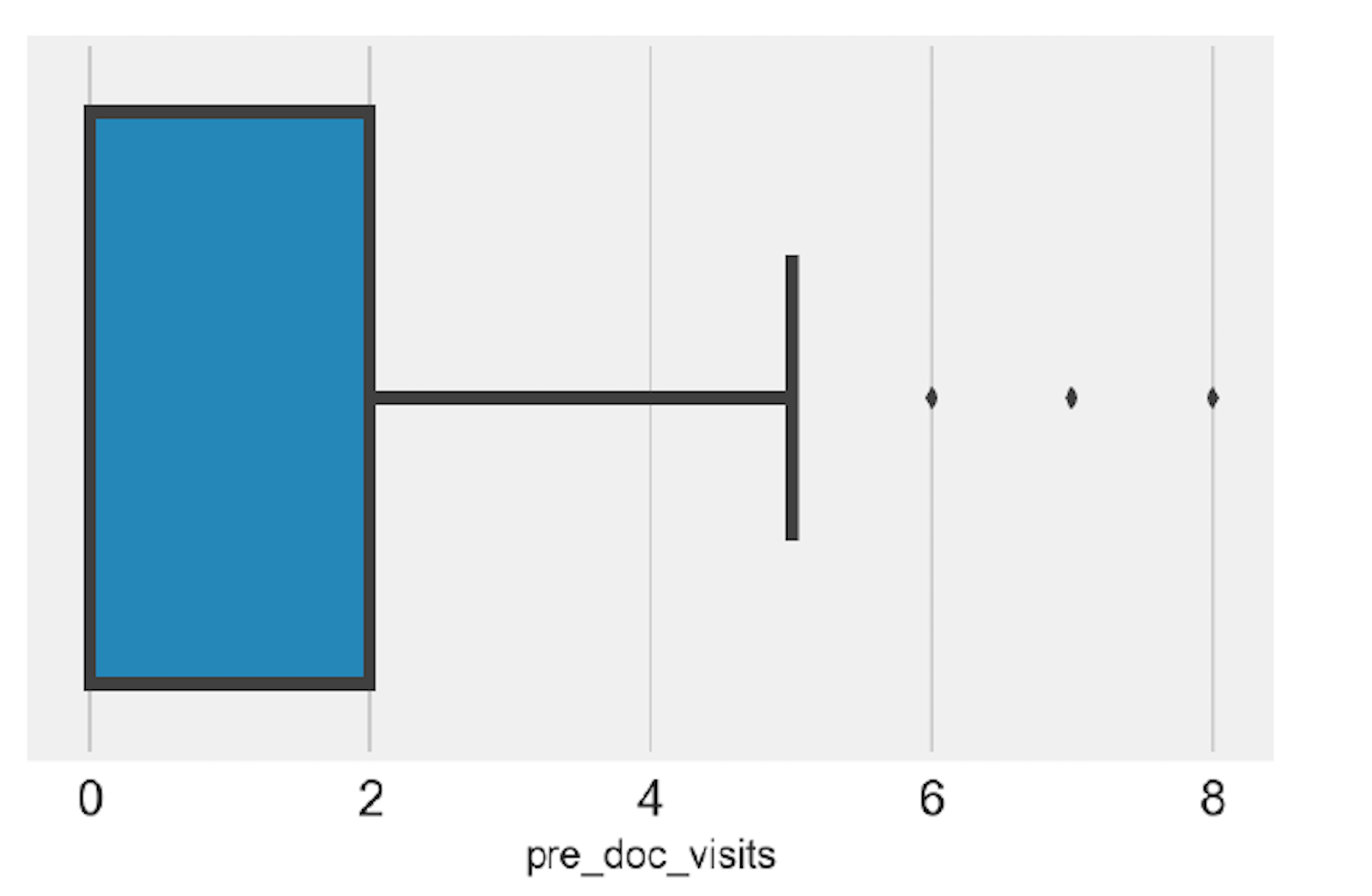
Outlier detection
sns.boxplot('pre_doc_visits', data=df_eda)
plt.tick_params(axis='both', labelsize= 15 )
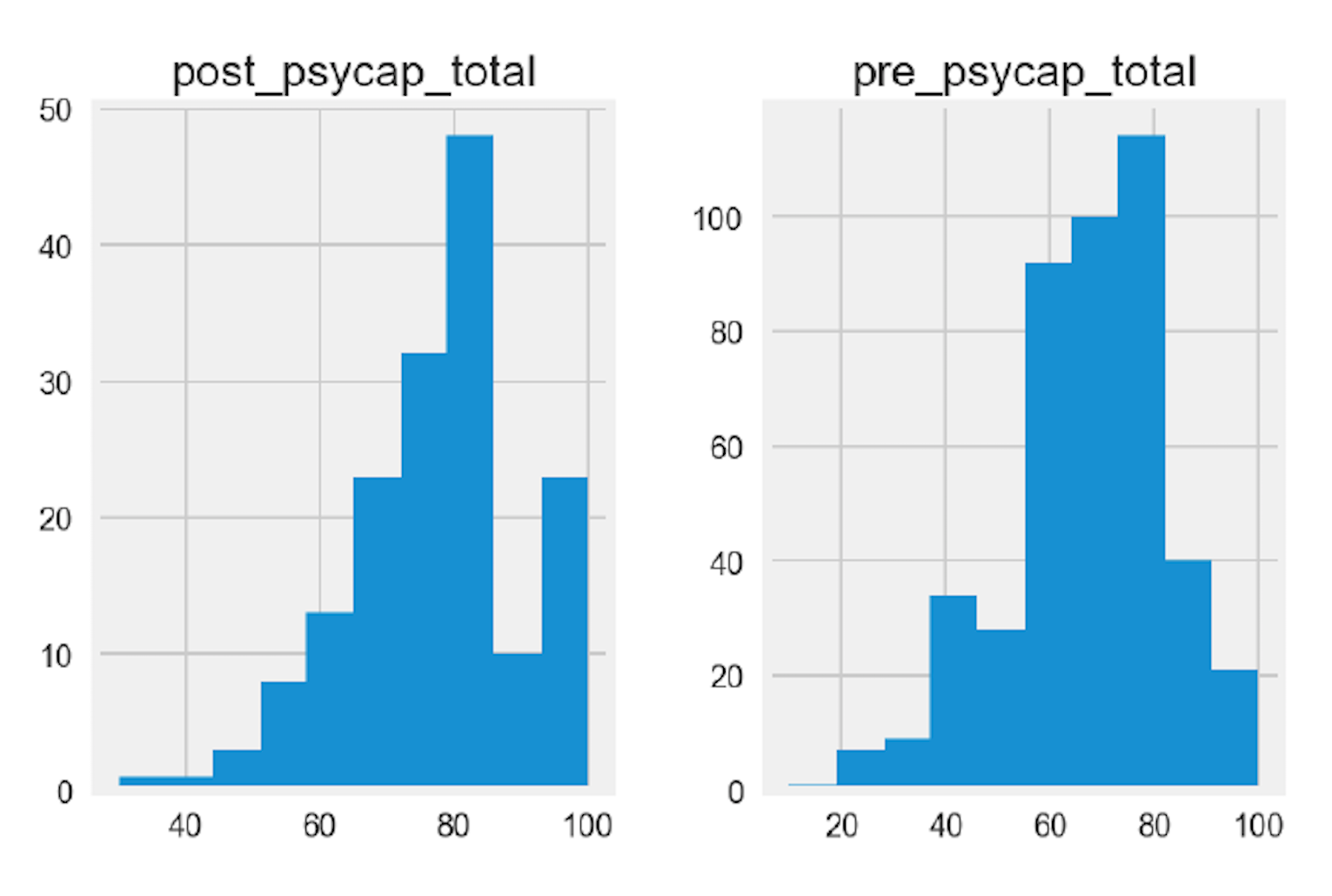
df_eda[['pre_psycap_total','post_psycap_total']].hist()
2.2.2 Interesting Insights
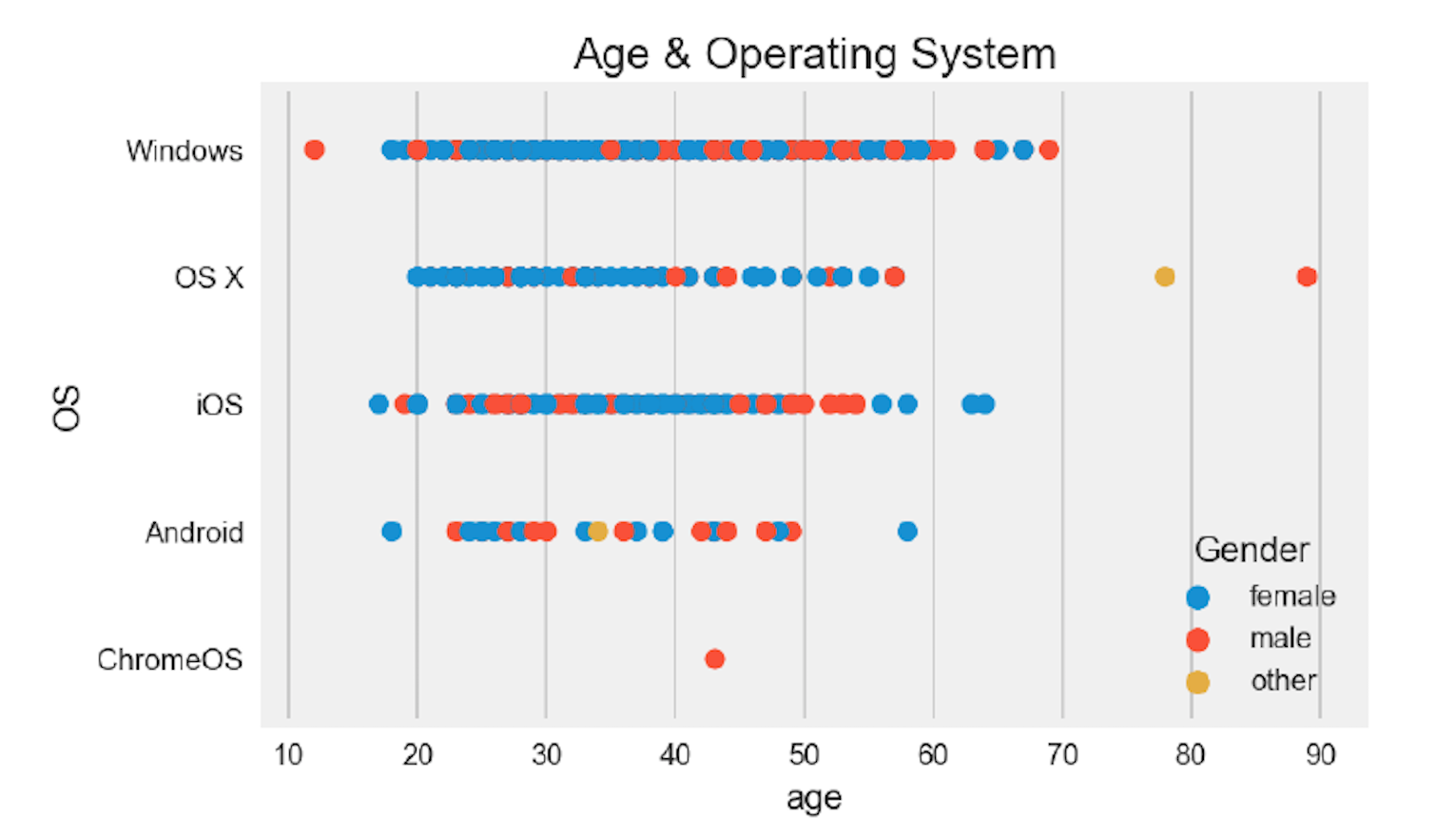
ax = sns.stripplot(x="age",y='OS' ,hue="Gender", data=df_eda,size= 7 plt.title('Age & Operating System',fontsize= 15 )
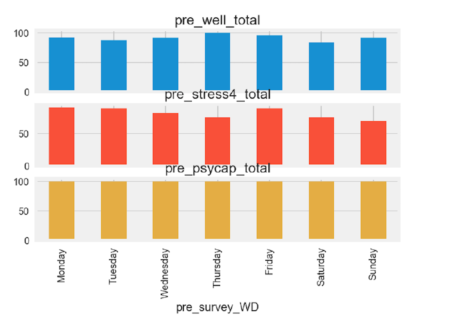
df_grouped.plot(kind='bar', x='pre_survey_WD',subplots= True ,
legend= False )
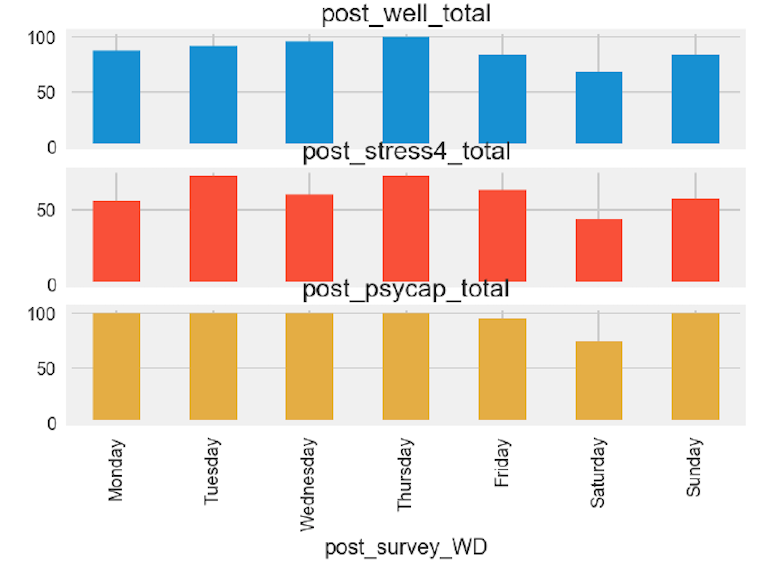
df_grouped_2.plot(kind='bar', x='post_survey_WD',subplots= True,
legend= False )
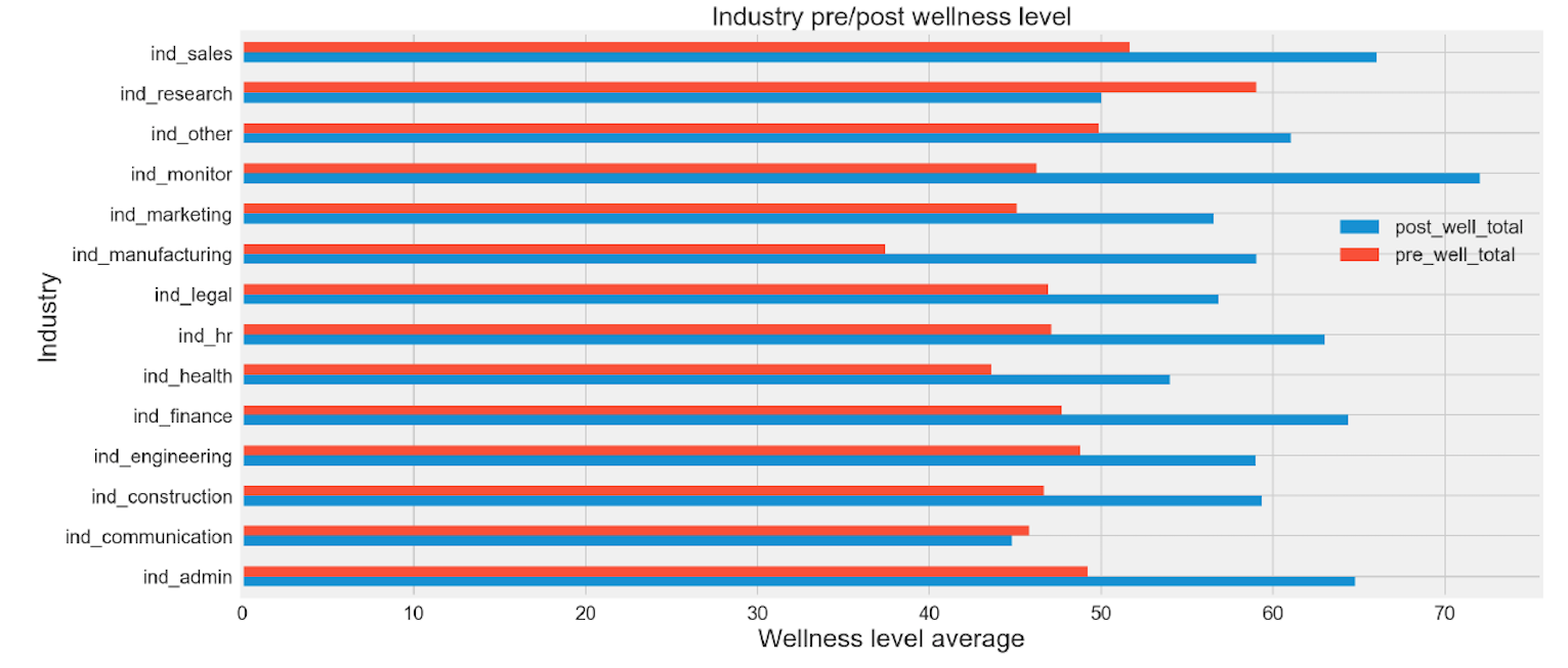
industry-wide pre and post mean wellness total
df_eda.groupby('industry')['post_well_total','pre_well_total'].mean().plot(kind='barh',figsize = ( 16 , 8 ))
plt.xlabel('Wellness level average',fontsize= 20 )
plt.ylabel('Industry',fontsize= 20 )
plt.title('Industry pre/post wellness level',fontsize= 20 )
plt.legend(loc='upper right', bbox_to_anchor=(1., 0.7),fontsize= 15 )
plt.tick_params(axis='both', labelsize= 15 )
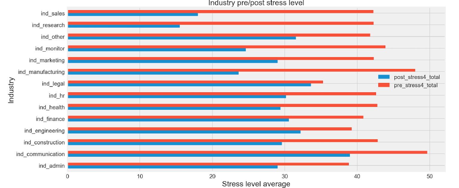
industry-wide pre and post mean stress total
df_eda.groupby('industry')['post_stress4_total','pre_stress4_total'].mean().plot(kind='barh',figsize = ( 16 , 8 ))
plt.xlabel('Stress level average',fontsize= 20 )
plt.ylabel('Industry',fontsize= 20 )
plt.title('Industry pre/post stress level',fontsize= 20 )
plt.legend(loc='upper right', bbox_to_anchor=(1., 0.62),fontsize= 15 )
plt.tick_params(axis='both', labelsize= 15 )
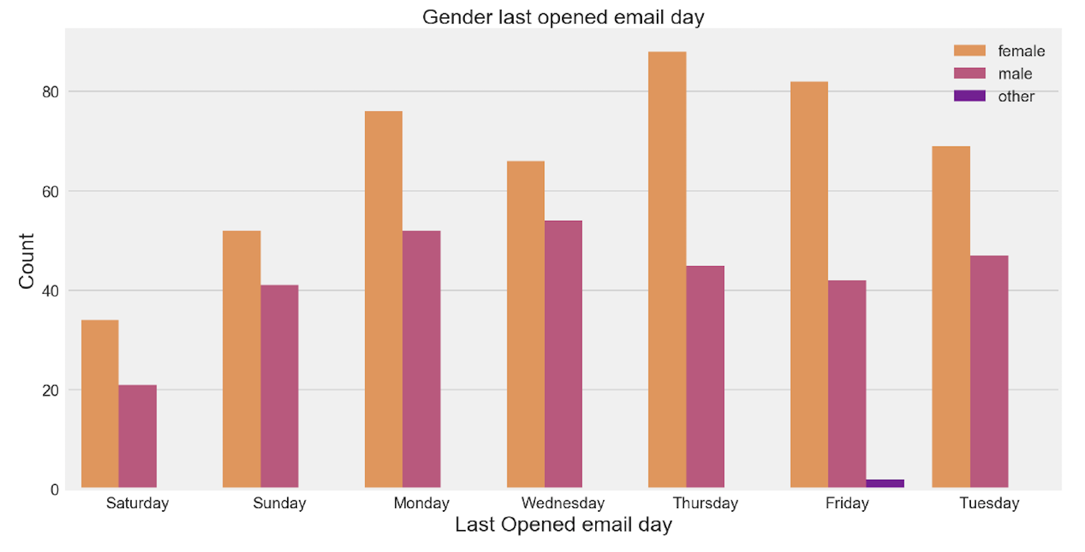
plt.figure(figsize=( 15 , 8 ))
sns.countplot(x="last_opened_email_WD", hue="Gender", data=df_eda, palette="plasma
plt.tick_params(axis='both', labelsize= 15 )
plt.ylabel('Count',fontsize= 20 )
plt.xlabel('Last Opened email day',fontsize= 20 )
plt.title('Gender last opened email day',fontsize= 20 )
plt.legend(loc='upper right',fontsize= 15 )
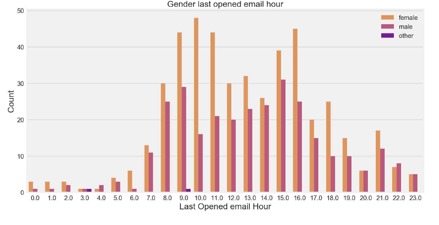
plt.figure(figsize=( 15 , 8 ))
sns.countplot(x="h_last_opened_email", hue="Gender", data=df_eda, palette="plasma_r")
plt.tick_params(axis='both', labelsize= 15 )
plt.legend(loc='upper right',fontsize= 15 )
plt.ylabel('Count',fontsize= 20 )
plt.xlabel('Last Opened email Hour',fontsize= 20 )
plt.title('Gender last opened email hour',fontsize= 20 )
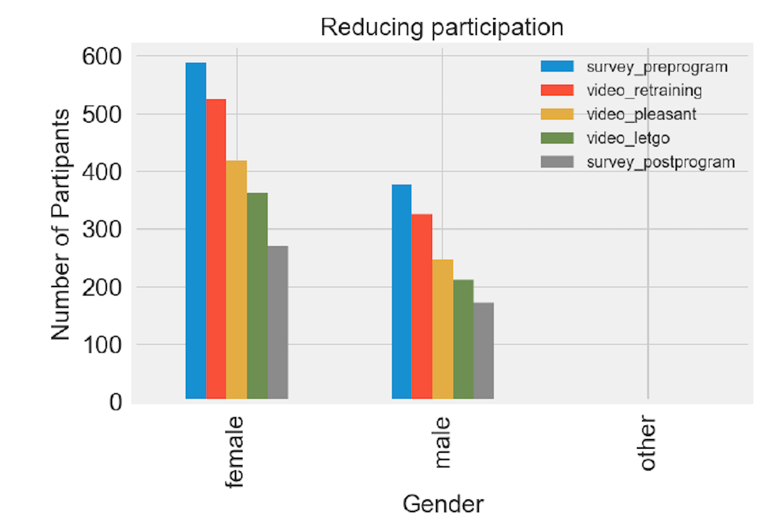
df_clean.groupby('Gender')['survey_preprogram','video_retraining','video_pleasant','video_letgo','survey_postprogram'].count().plot(kind='bar',figsize=( 6 , 4 ))
plt.ylabel('Number of Partipants',fontsize= 15 )
plt.xlabel('Gender',fontsize= 15 )
plt.title('Reducing participation',fontsize= 15 )
plt.legend(loc= 0 ,fontsize= 10 )
plt.tick_params(axis='both', labelsize= 15 )
2.3 Modelling and Machine Learning
2.3.1 Correlation and Feature selection
1. Drop all post survey features from dataframe
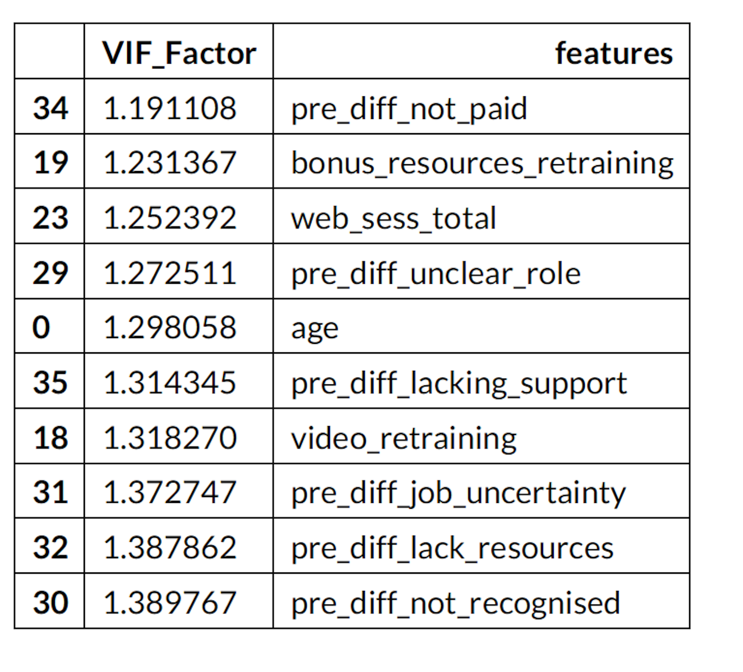
2. Variance Inflation Factor
3. Correlation Heatmap
vif.sort_values(by='VIF_Factor',ascending= True).head( 10 )
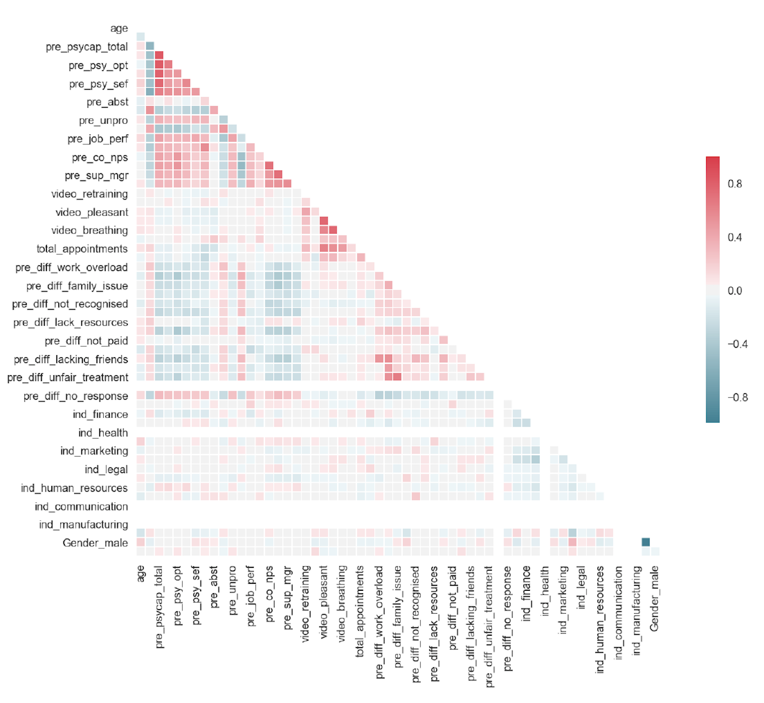
sns.set(style="white")
make correlation matrix_
corr = X.corr()
Mask the upper half
mask = np.zeros_like(corr, dtype=np.bool)
mask[np.triu_indices_from(mask)] = True
assign plt size
f, ax = plt.subplots(figsize=( 11 , 9 ))
cmap = sns.diverging_palette( 220 , 10 , as_cmap= True )
Call the heatmap with the mask and correct aspect ratio
sns.heatmap(corr, mask=mask, cmap=cmap, vmax= 1 , center= 0 ,
square= True , linewidths=. 5 , cbar_kws={"shrink":. 5 })
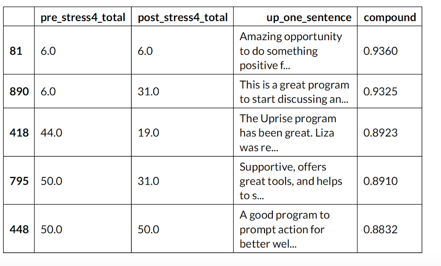
2.3.2 Sentiment Analysis (Customer Reviews)
Top five reviews based on sentiment of the reviews
df_sent.head()
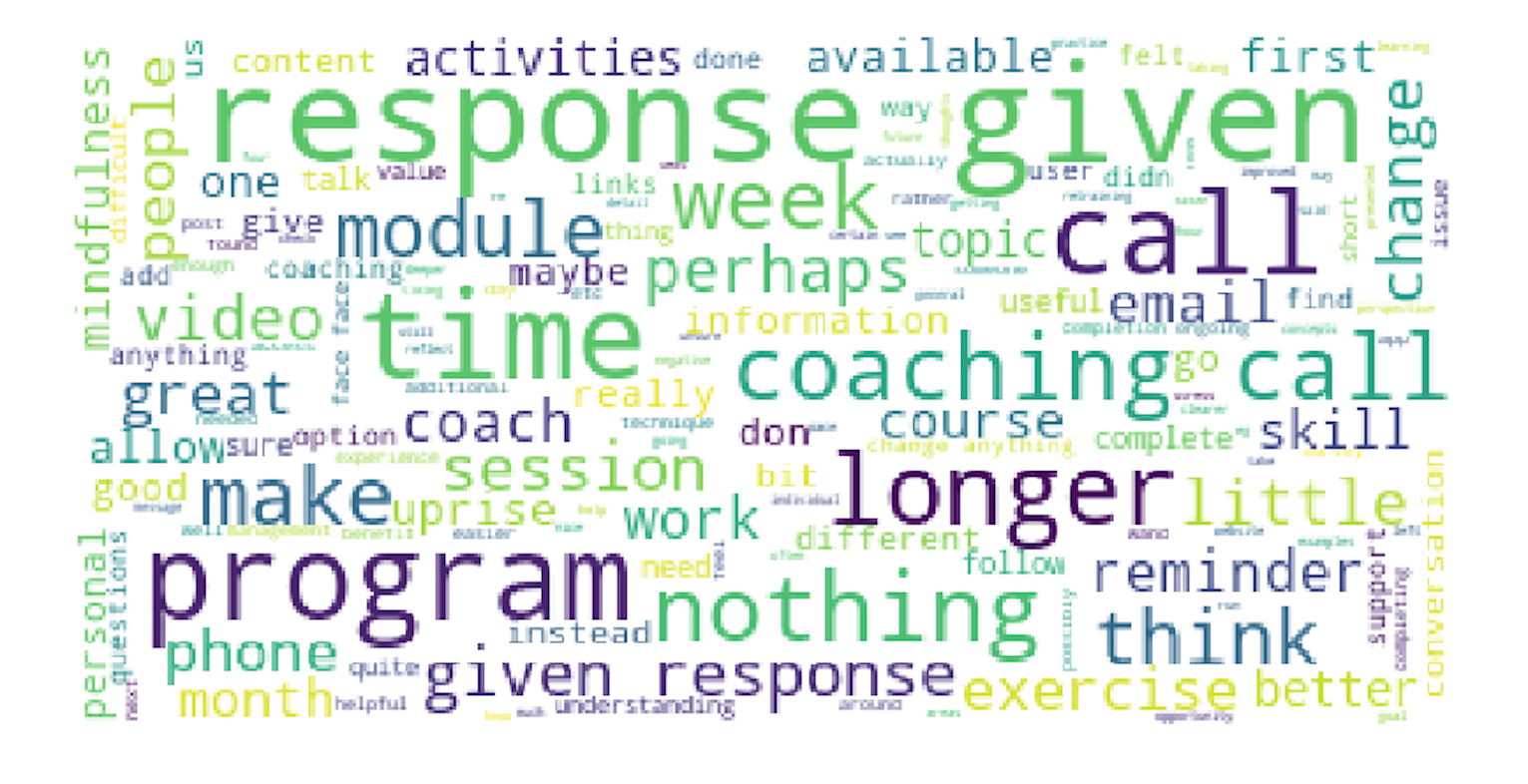
print(wordcloud)
fig = plt.figure( 1 )
plt.imshow(wordcloud)
plt.axis('off')
plt.show()
fig.savefig("word1.png", dpi= 900 )
2.3.3 Application of Machine Learning Algorithims
Target Variable : Predict factors for post survey completion for Uprise customers
1. Up scaling imbalanced data set
2. Multiple model comparison
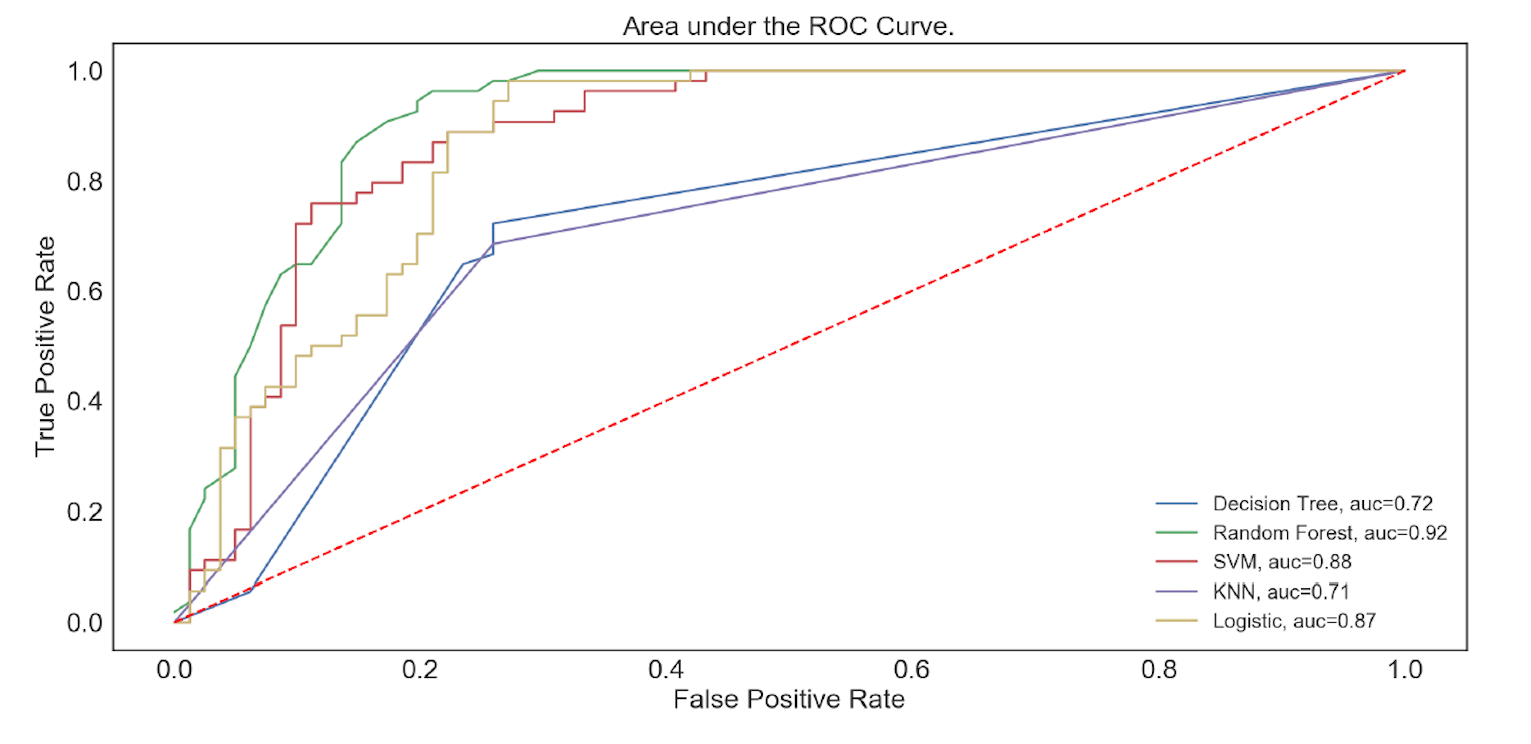
3. AUC ROC
Note the problem of imbalanced target variable
X_train.complete_post_survey.value_counts()
1 209
0 103
Separate majority and minority classes
df_majority = X_train[X_train.complete_post_survey== 0 ]
df_minority = X_train[X_train.complete_post_survey== 1 ]
Upsample minority class
df_minority_upsampled = resample(df_minority,
replace= True , # sample with replacement
n_samples= 209 , # to match majority class
random_state= 123 ) # reproducible results
Combine majority class with upsampled minority class
df_upsampled = pd.concat([df_majority, df_minority_upsampled])
Display new class counts
df_upsampled.complete_post_survey.value_counts()
1 209
0 209
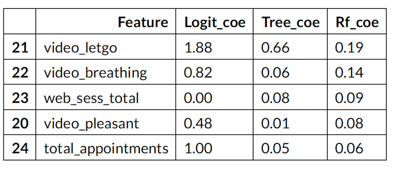
sort values by randomforest
f_coe.sort_values(by='Rf_coe',ascending= False ).head( 5 )
AUC-ROCAUC-ROC
I used the AUC-ROC curve as a metric to test my models because of the class imbalance in
my data set. AUC-ROC is not effected by class imbalance however accuracy score is affected.
class_summary
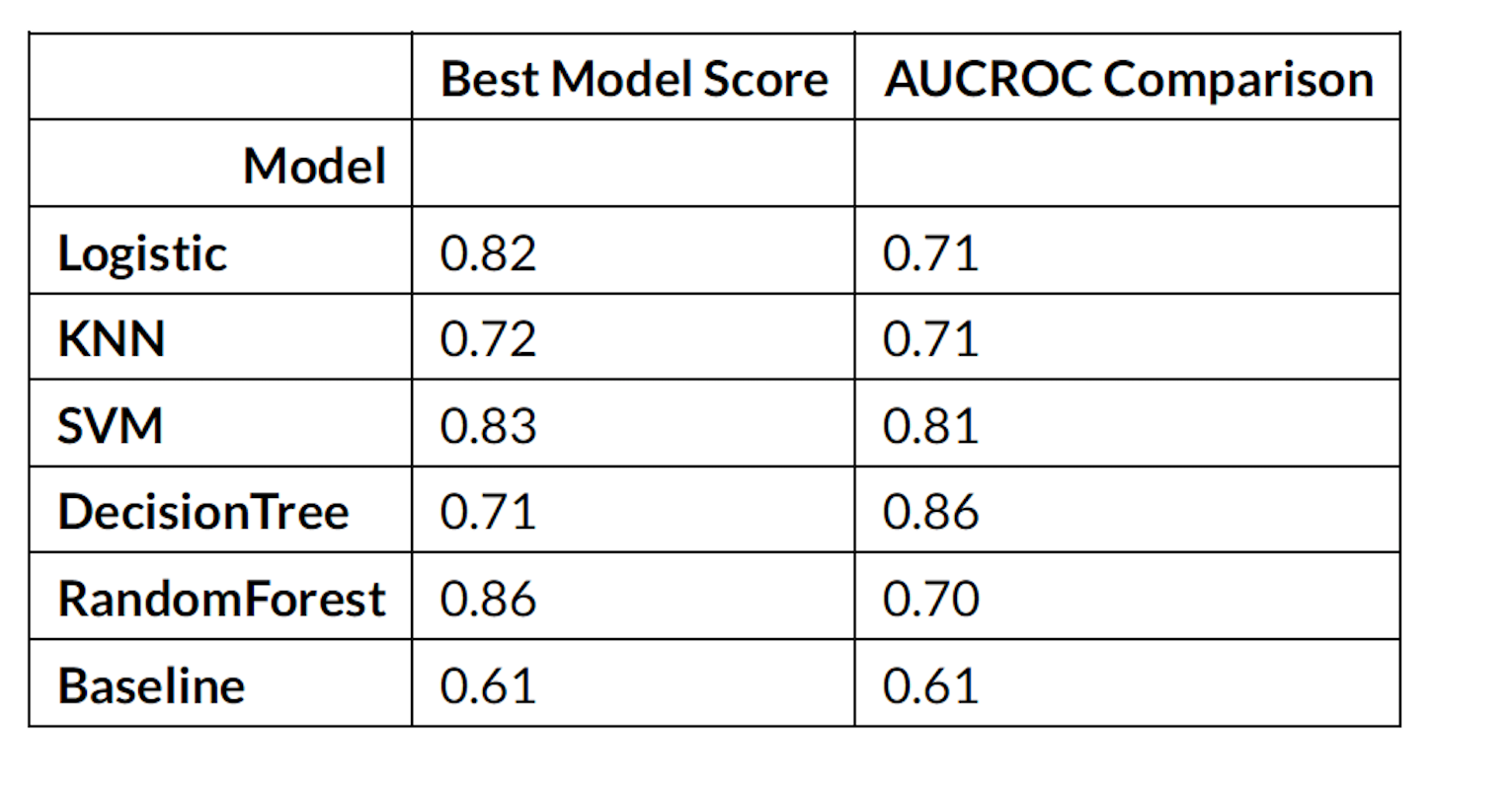
AUC_ROC
Written on August 8, 2018